The Science Of Brand Colours
May 28, 2013 in Daily Bulletin

Leo Widrich took a look at how colours affect our perceptions of brands:
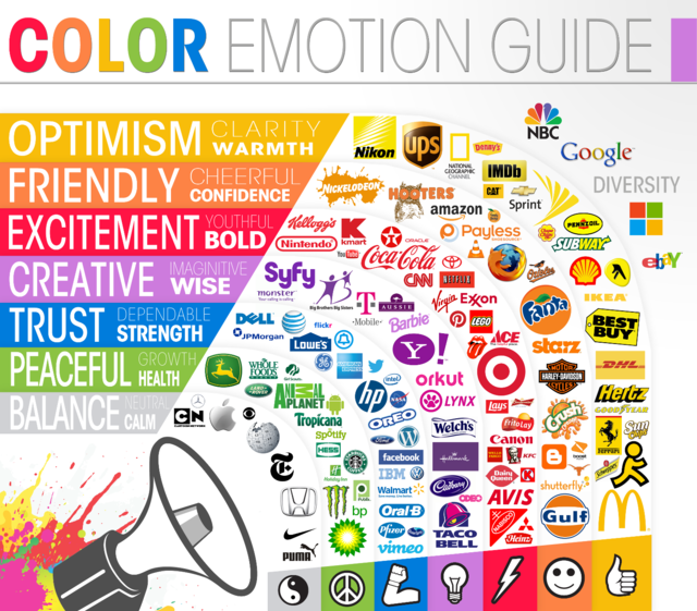
- Different colours elicit different emotions as the infographic above shows. Red suggests excitement while Centives’ own yellow suggests optimism, clarity and warmth.
- These emotions are then used to guide specific actions. Red’s excitement is used to advertise clearance sales. The power we associate with black is used to sell luxury products.
- Different genders react to different colours differently and it’s possible to tell who a certain product or service is targeting based on its colour scheme alone.
- Women, for example, are quite fond of purple, while men greatly dislike it. Both genders like blue and green and dislike brown and orange.
In the full article Widrich presents several more fascinating infographics. He also looks at how colours can help people instantly identify certain brands, the importance of testing hypotheses and why hyperlinks are blue. Read it here.
Source: Fast Company
What’s interesting is the old multi-colored rainbow Apple logo use to be at the completely other end of that spectrum….