The Design Of Magazine Covers
February 15, 2014 in Daily Bulletin

Magazine covers are designed in fascinating ways:
- Magazines have to make it clear to customers that what they’re seeing on the newsstand is a new issue. They do this by having vastly different colour schemes from issue to issue.
- They started putting giant photographs on the front cover in 1962. These connect with the reader through a recognizable celebrity face.
- In 1965 Cosmopolitan started the era of magazines with a lot of text surrounding the main picture. This gave buyers a sneak peek of what was in the magazine.
- Celebrity gossip magazines always have yellow text on the cover because yellow draws attention at newsstands.
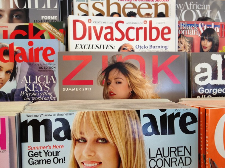
- On newsstands in the US magazines are generally arranged in a waterfall formation with their top third showing. Therefore the main headline is put close to the top.
- In the UK magazines have their edges overlaid upon one another and thus the main headlines go on the left.
The full article is fascinating and shows examples of each of the things mentioned above. It also talks about how magazines have continued to evolve, why titles like Atlantic and Time have a different look and much more. You should read it here.
Source: Slate
Join the Discussion! (No Signup Required)