The Design Of American Embassies
September 18, 2012 in Daily Bulletin

As the impact of events in Libya continue to reverberate across the United States, Joshua E. Keating looked at how the design of American embassies have evolved over the years:
- An embassy needs to balance between protecting the personnel inside it, and being seen as transparent and open to the people in the host country.
- During the early years America didn’t build its own embassies – it simply bought buildings abroad. This changed in 1926 when an agency was formed to design and build American embassies.
- At the height of The Cold War the United States embraced a modernist architectural design that was the epitome of American swagger.
- Design took a back seat to security in 1983 when 63 people were killed in a suicide bombing at the US embassy in Beirut.
- A committee then created a set of guidelines for embassies to adhere to, to ensure the personnel’s security. However Congress never funded these expensive construction projects, and most embassies didn’t change much.
- This changed in 1998 after 223 people were killed in US embassies in Kenya and Tanzania.
- After 9/11 the United States ratcheted up security guidelines. A one-size-fits-all “McEmbassy” with stylistically identical designs for “small” “medium” and “large” buildings was created. These designs included high fences and a 100 feet of space between the embassy and the street.
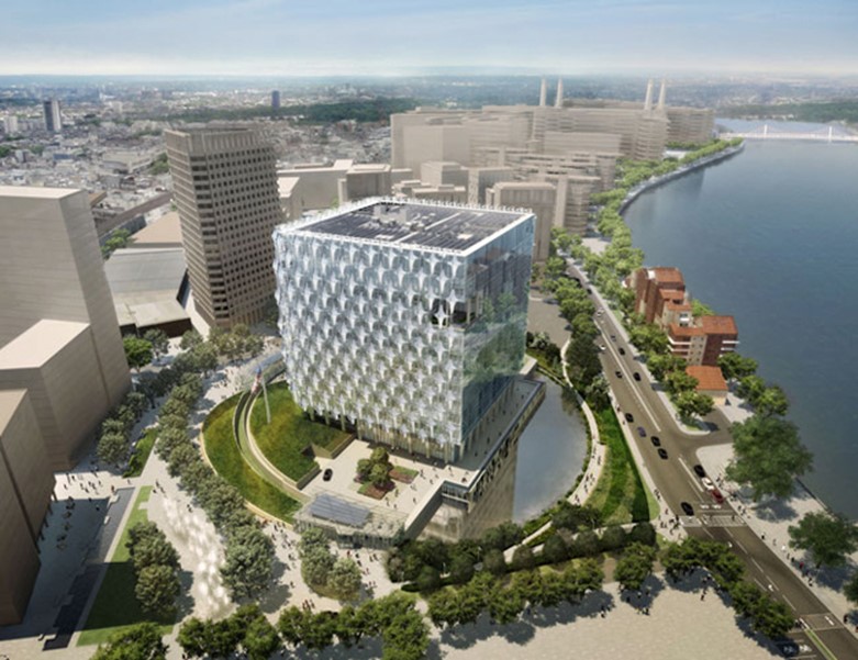
- Since then however America has relaxed its standards a little, allowing for more creative designs that maintain security while elevating form. The planned American embassy in England (pictured above) is an example.
Read more about how architectural norms might change once again in the wake of recent events, examples of the evolution of American embassy design, and what diplomats think about the various developments, over here.
Source: Foreign Policy
Join the Discussion! (No Signup Required)